Somebody on Reddit posted their store’s EOD report (probably not the best idea for them, but oh well) and the list of numbers was just begging to be plotted. So I did so.
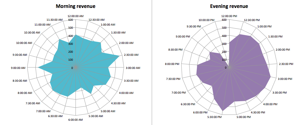
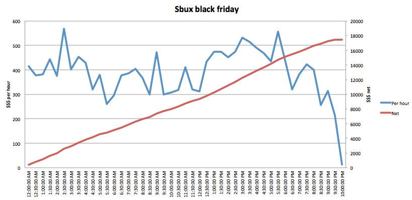
I learned how to make a running totals column in Excel, and used a “Filled Radar” chart for the first time – I thought it showed the hourly fluctuations particularly well, since it’s an hourly report and the chart resembles a clock.